Timon: Multiple Cards
Role: Product Designer Industry: Fintech / Cards Platform: Web & Mobile Scope: Card purchase flow and Landing page design
This project was a fast-paced growth sprint focused on improving how users discover, purchase, and manage cards within the product. Previously, the experience only displayed single cards in a list, leaving users to figure out which option best matched their needs. As Timon's card catalogue expanded across countries, providers, and spending categories, the experience became harder to navigate and less scalable. Working closely with the Growth manager, we redesigned the experience in an intensive physical 8-hour sprint focused on making card discovery smarter, more contextual, and easier to adopt.
The existing experience had several limitations: · Users had difficulty understanding which cards were best for their needs. · The growing catalogue lacked structure as more countries, providers, and card types were introduced. · Users often needed multiple cards for related use cases but had to purchase them separately. · The experience lacked flexibility for power users managing subscriptions, travel, and business spending. The challenge was not just about adding more cards — it was about organizing them in a way that felt intuitive and useful.
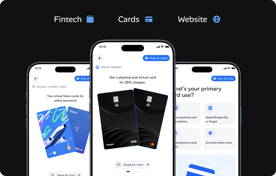
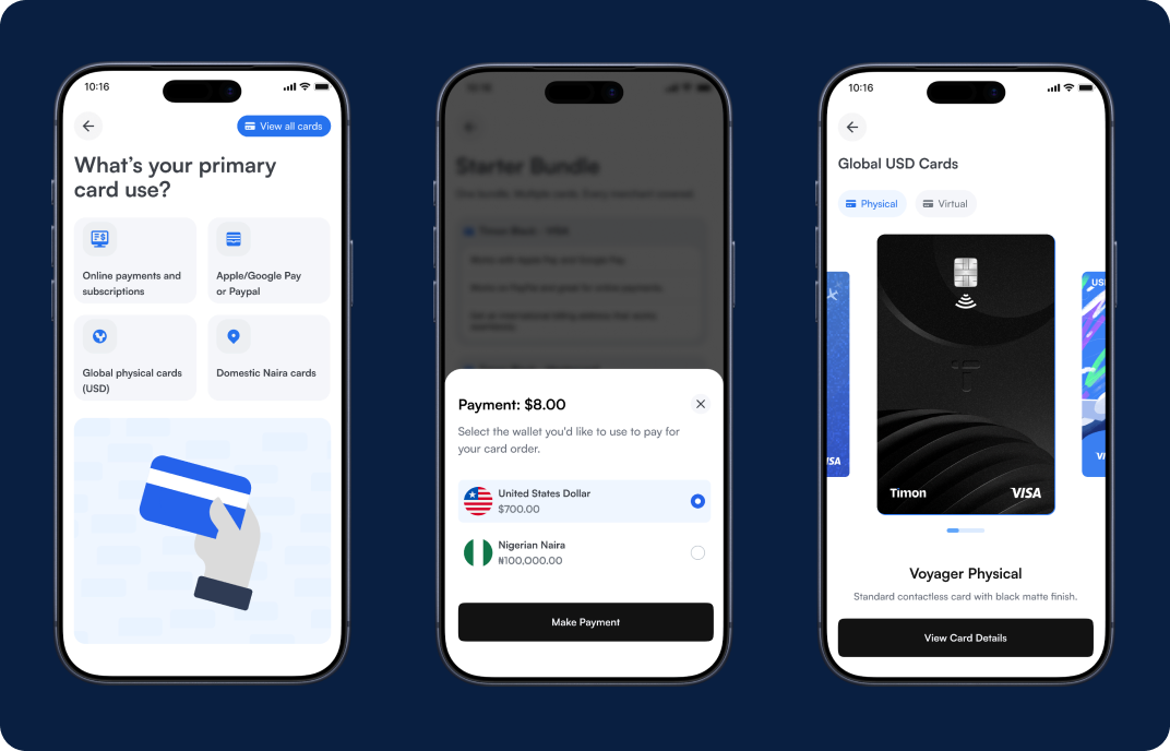
Grouping Cards by User Intent Instead of showing a flat list of cards, we introduced a more structured discovery experience by grouping cards based on: · Use cases · Countries · Providers · Spending behaviour Examples included: · Travel Cards · Online Shopping · Subscription Cards · Nigeria Spending · USD Payments This helped users discover cards based on what they wanted to achieve rather than trying to understand financial product terminology.
We also introduced bundle cards, allowing users to purchase complementary cards together at discounted pricing. For example: · Physical Naira Card + Virtual Dollar Card · Travel + Subscription setup · Local + International spending bundle The idea came from observing real user behavior where people often needed multiple cards for connected experiences. Bundles made the product feel more thoughtful while also increasing perceived value.
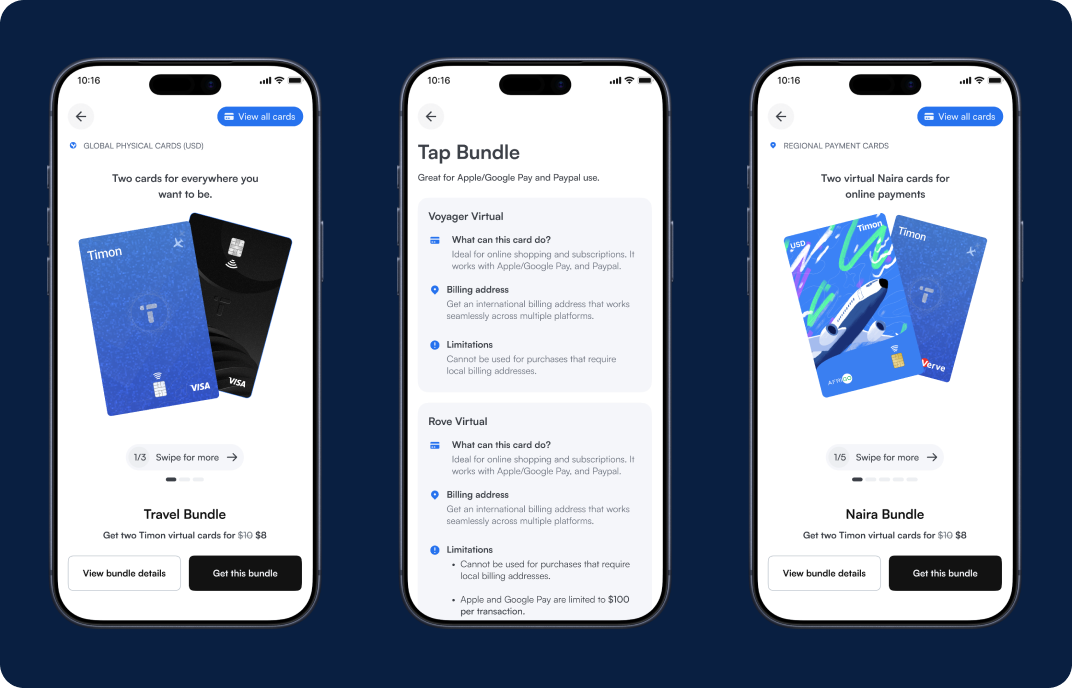
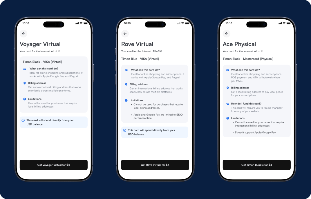
As the card ecosystem expanded, one surprisingly fun part of the sprint was exploring how cards should be named and categorized. We realized naming played a huge role in: · Discoverability · User understanding · Product personality · Marketing appeal Instead of technical or generic naming, we explored clearer and more lifestyle-oriented structures that made the catalogue easier to scan and more memorable.
Product Improvements · Smarter card discovery experience · Better organization across countries and providers · Simplified multi-card adoption · Bundle discounts that increased flexibility and value perception Growth Impact The feature was designed specifically with growth and adoption in mind, balancing usability with product marketing strategy.
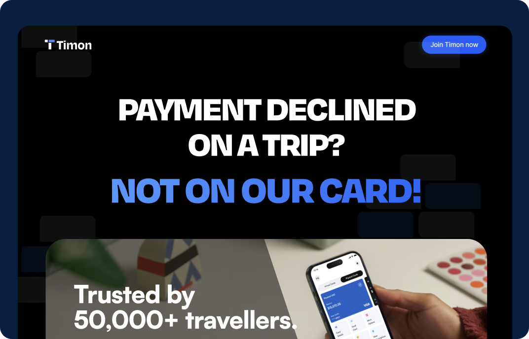
At the end of the sprint, we also created a dedicated cards landing page focused entirely on showcasing Timon's growing card ecosystem. I designed the experience in Figma and built the landing page using Claude inside Visual Studio Code before publishing it live. The page focused on: · Card bundles · Lifestyle-based card discovery · Feature highlights · Animated card presentation · Growth-focused conversion messaging
 Check live landing page here →
Card Purchases
· Increased multi-card purchases by 34% after introducing bundle cards and intent-based recommendations. · Bundle card adoption accounted for 41% of all new card purchases within the first rollout phase. · Users purchasing more than one card in a single session increased by 12%.
Faster Decision Making
· Reduced average time spent selecting a card by 37% through grouped discovery and guided recommendations. · Users reached checkout faster because cards were organized by: use case, country, provider, and spending intent. · This removed the friction of comparing unrelated card types manually.
Landing Page Performance
The dedicated cards landing page became a key acquisition and education surface for the feature launch. · Over 18,000 landing page visits during the initial growth campaign. · Landing page conversion rate improved by 19% compared to previous feature announcement pages. · Average session duration increased by 24%, showing stronger engagement with the new card catalogue experience. · Animated card previews and bundle positioning contributed to higher interaction rates across featured cards.
Business Impact
· Improved visibility and discoverability across Timon's growing card ecosystem. · Increased adoption of newer card types that previously had low exposure. · Created a scalable structure for future card expansion across regions and providers. · Successfully aligned product UX with growth and marketing objectives during a rapid sprint cycle.
This sprint gave me a deeper understanding of how differently growth and marketing teams approach product thinking compared to traditional product design. Instead of focusing purely on flows and usability, the conversations centered around: · Positioning · Perceived value · Conversion psychology · Product storytelling · Packaging features for adoption It was one of the most insightful collaborative sprints I've worked on because it showed how product design can directly support growth strategy without sacrificing usability.